Welcome to the Vivo NEX3 you might have already seen that teaser I made about a month ago but now the phone has been officially announced, and we can really get into the meat of it.
Taking a sneak peek at its retail package, you can see straight away that a lot of love has gone into it. There’s a 44W super-charger, a pair of noise-canceling air phones, and of course a USB-C cable. With a record-breaking display, an ultra-high-resolution camera, and some class-leading hardware.
- Huawei Watch GT Review | A Watch That Acts Like A Smartwatch
- iPhone 11 vs 11 Pro – What Apple Didn’t Tell You About
- Huawei Takes A Dig At Samsung
- iPhone 11 And 11Pro Just Released! | Here Is All What You Need To Know.
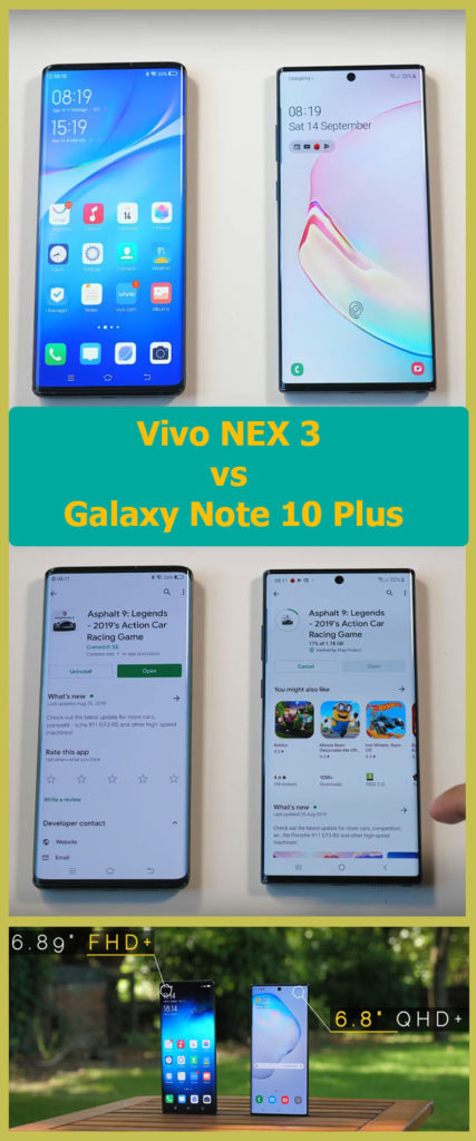
And in this review comparison, we’ll compare Vivo NEX 3 vs Galaxy Note 10 Plus, which is one of the best Android smartphones in the market, if it’s not the best at all. And in the end, we’re going to crown a winner.
The short conclusion is this each of these devices really helped me appreciate what the other was able to achieve, and what exactly I mean by that is I really like how the new 10 plus feels.
The note is far lighter and this combined with it being a sliver thinner makes it feel substantially more svelte. If you’ve had the chance to pick up one of Apple’s newer iPads, I would describe picking up the note 10 plus as a similar experience.
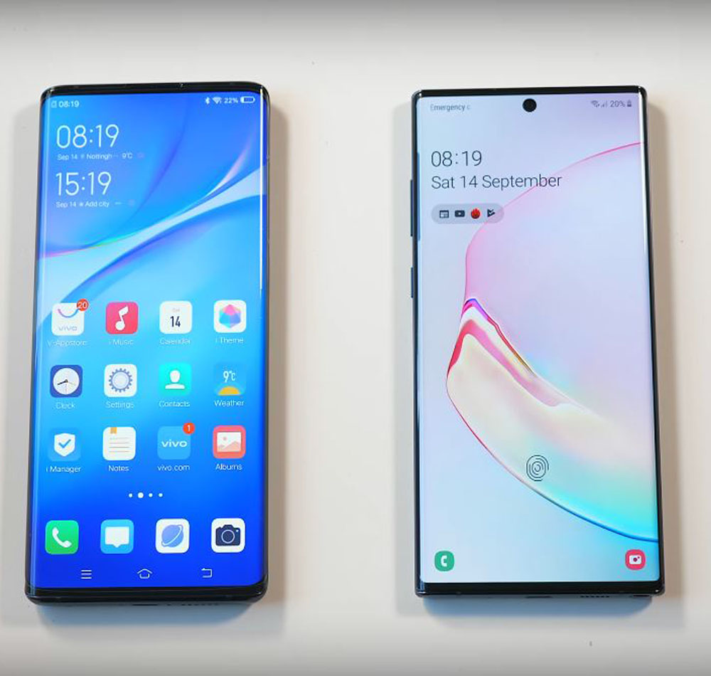
The big reason why I made this comparison is that whilst these two phones look very similar on paper and to some people probably, even in person they’re made with very different design philosophies; whilst the note is built on refinement and polish, the next feels new daring and experimental and that also translates to the way they look aside from that psychedelic or aglow option.
The note 10 Plus is a fairly plain looking phone, whilst the NEX introduces a pretty bizarre circular camera setup. Kind of reminiscent of a mechanical watch face, and just when you thought you’d seen every single possible smartphone finish.
Another one in bright light you get wide bands of brander color, and as you tilt the phone, it turns into a more consistent gradient. and then you’ve got buttons where while Samsung has mildly experimented by moving all the physical buttons to the left of the phone, Vivo has just straight-up removed them in this continuous pursuit of complete seamlessness.
They’ve been replaced with virtual equivalents, which to be fair still give a satisfying response and they’re easy to feel for, but I wouldn’t call this in itself an advantage. What is an advantage though, is the fact that Vivo retained the headphone jack, whilst the note did not.
So kicking off the deep dive with a bit of charging, we’ve already seen that the NEX comes bundled with a 44W charger; and whilst the note is technically capable of 45W, it only comes bundled with a 25W adapter. So that’s what most people are going to use as expected.
Battery capacities. They are pretty similar and actually pretty high. On both, you get a 4500mAh on the NEX 3, and 4300mAh on the Note 10 Plus.
Do you ever wish that there was one smartphone released per year that had the best elements of all the other devices? Trust me, sometimes I do. And having the cameras on these two devices together is an agonizing example of that. Because there is just so much joint potential here.
Both bring something completely different to the table, and in this case, we’re talking the vivo’s ability to capture stunning 64MP photos, and the Notes color processing and it’s video quality. So yes providing you’re in good light, the NEX 3 is 64MP photos look spectacular. I wasn’t sure what to expect going in, but these photos are notably more detailed when you crop in then the note’s 12MP ones.
I wouldn’t use the 64MP mode in low-light, but I was surprised to see even in average lighting. Even when the subject isn’t being blasted by the Sun, it’s still getting way more information in. Vivo also has a super macro mode that lets you get really tight focus on objects that are right in front of you, plus the phone’s wide F 1.8 aperture compared to the Note 10 plus’s. Means that photos in the day have a lot more natural background blur.
This phone truly has the potential for even more impressive and more cinematic shots than on the note, but generally, I find that Samsung processes color better. And by comparison, the NEX 3 shots can seem a little pale.
Both of these phones are brilliant for taking photos, but the Note 10 Plus is well ahead of when it comes to both video quality and video stabilization, and this applies to the front cameras too.
Another thing worth noting if you’re trying to have a log, for example, the Galaxy Note and Plus this front camera is far more capable. It records are not just 4k resolution versus 1080p on Vevo, but the dynamic range is better even the audio quality is better.
One very important consideration with the NEX3 is the fact that the chip inside this phone is faster than both. The snapdragon and the Exynos versions of the note 10 plus armed with the snapdragon 855 plus the NEX3 is around 10% more powerful, but the note has a whole extra 4GB of ram and faster ufs 3.0 storage.
So in a weird kind of way, both versions are absolute performance tanks, but they specialize in different tasks. The NEX3 will pull ahead in gaming, whilst the note can handle more simultaneous applications at once and should be able to load things faster.
The ultra-settings are nearly stable 60fps on the NEX 3, and it’s gorgeous easily some of the best graphics I’ve ever seen on a phone. I’ve seen a lot of conversation about it, and there are lovers, and there are haters. so this is my tape, I spent a long time looking at and using the curved panels on Samsung phones, but it’s only when you see this side by side that you realize and just how curved the NEX 3 is. And with most games completely filling, the screen it’s impressive! It really does as advertised and make it feel that your content is spilling over the sides.
 The waterfalls are not really made for touching, it’s not like you’re getting more display to interact with. Mind you that’s needed; because, if they were responsive you’d be suffering accidental touches like crazy. And the waterfall is purely a visual thing, and it’s not like you can all of a sudden start scrolling lists using the sides of your phone.
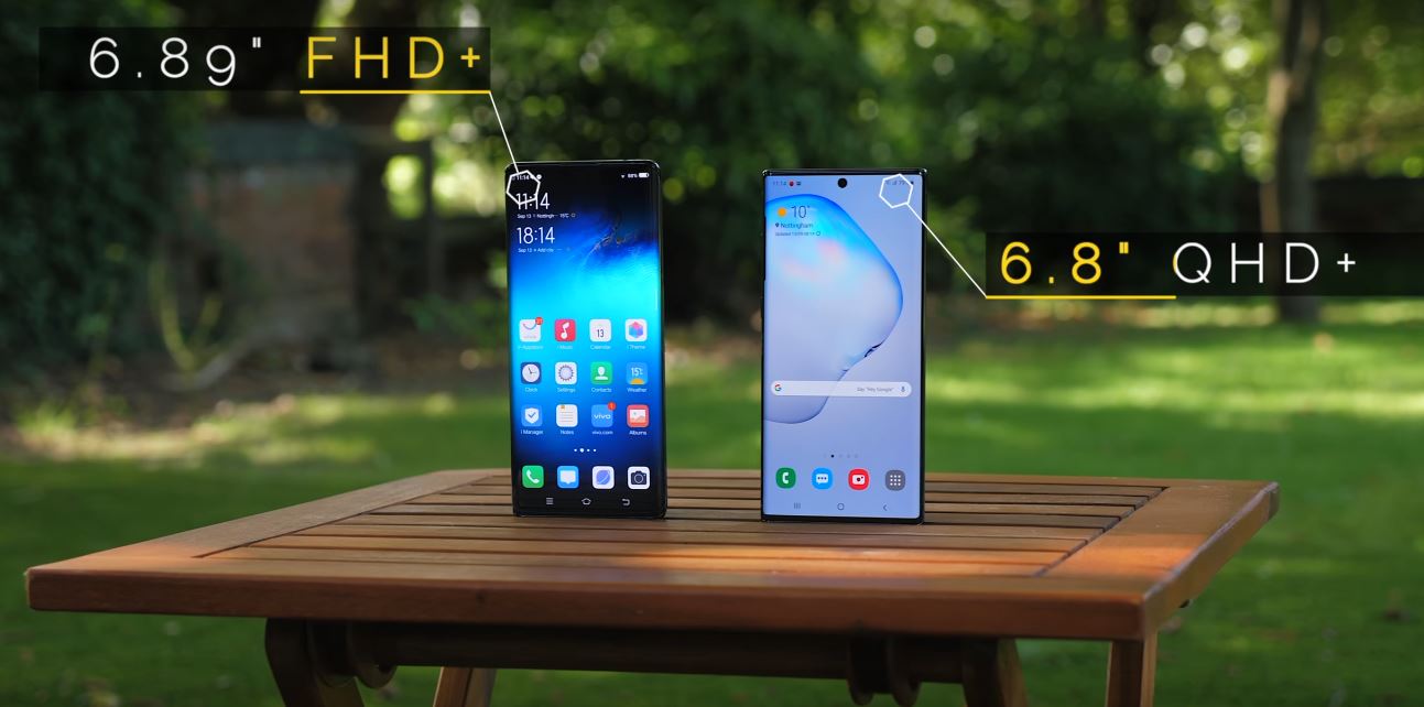
Also whilst both are similarly large Super AMOLED panels, the Note ends display is higher resolution with less screen glare – although. the fact that Samsung now filters blue light automatically from your display, does mean the Vivo has cleaner brighter whites. So waterfall display I don’t mind it, it looks impressive, it feels futuristic, but at the same time, it’s probably not up there with the priorities in terms of what I want from a phone.
Display: both devices also use in-display fingerprint scanners. The speed is about the same, but some sense ultrasonic scanner is technically superior. It needs less pressure to activate, and it can work even when your fingers are wet.
Although personally not a fan of that unlock animation it feels lacking especially when compared to Vivo’s customizable offering. And speaking of customizable offerings, the software you’re looking at here is Vivo’s fun touch OS and it shares some aesthetic traits of Samsung’s One-UI skin, like the rounded square icons but under the hood, they work pretty differently.
with Vivo, for example, you swipe up once from the bottom and you can see all your quick toggles, which is actually faster than the two swipes and a stretch you need to do the same on the Samsung. They’ve both got a dock mode, they’ve both got powerful battery-saving features, and both place an emphasis on reachability which is pretty important when you’re handling screens of these dimensions.
Alright, so up until this point there is a really close battle, and you’re probably thinking I don’t know which one is winning? But there are some things about the Notes and in fact, quite a few of Samsung’s more recent flagships that I like and that I think give it a bit of a leg up. The Note 10 Plus has microSD card support, the ability to wirelessly charge and wirelessly reverse charge other devices, plus an amazing haptic engine.
In fact, the larger vibration motor in this phone is a big part of why there’s no headphone jack. there has effectively taken its place, and I get it better vibration quality sounds like one of those take it or leave it, don’t really care kind of features until you use it.
Typing and just the subtle vibrations you feel when interacting with the UI feels spot-on on the Note. You get IP certification for water and dust resistance, and there’s more even the speakers are fantastic on the note; because the phone has an earpiece that’s so tiny it’s almost invisible.
Samsung has switched the speaker audio to instead come from the top of the phone, as well as the main speaker on the bottom. It sounds a lot more immersive than on the Vivo which only has a single unit, and then whilst it’s not a massive deal for me, we also can’t ignore the fact that the note comes with the s-pen.
It’s just impressive that this is being stored inside the phone, and yet they’ve still managed to make a phone that is both slimmer and lighter and contains a similar-sized battery. And both phones also have a massive 256gigs of internal storage, and both have a 5G variant, but for what it’s worth in every single room I tried the Wi-Fi speed on the NEX range from slightly faster to a lot faster than the note.
The conclusion is this: I mentioned earlier that each one of these devices really helped me appreciate the other, and hopefully as you’ve gone through this detailed review, you’ve started to see why these are two top-level flagship smartphones, but they’ve gone about achieving this in pretty different ways.
That waterfall display the flagship feature of the NEX 3 is cool. I like it but I don’t think it adds much to the daily smartphone experience, and I think things like great haptics or the speaker quality on the Note are subtler more important features.
The NEX 3 brings a lot more than just this display, its larger battery, it’s faster charging, it’s more powerful chip, and the headphone jack they all make it relevant. But if the price was no object, I would still side with the note on balance as the better-rounded device.


